Thursday, 4 September 2014
One down, Two to Go
So, just another year. Having come out relatively unscathed from my first year, I am quietly optimistic about my second year at college I have to admit. Our first week back saw the introduction of a new topic 'Multiples' which has slightly baffled me, mainly as to what to consider for it. The possibilities seem to be extensive. Look for a S.O.S. very soon.

Sunday, 25 May 2014
Pathways Project
So, that’s the end of Conceptual studies and Drawing classes
as they are now merging together, under the umbrella of the Pathways Project. This
Project is an attempt to help us hone in on what we plan on doing for the next
two years. A part of this exploration is to do a presentation showing artists
that personally inspire you from each of the three Pathways: Visual Communication,
Contemporary Art Practice, Applied Design Craft.
For Contemporary Art Practice I chose Edward Hopper as my
first artist. His paintings charting the life of small town America are so
visually striking with his contrast between dark and light which never fail to
draw you in. Yet, I think the reason I like them so much is the fact that they
have a true sense of voyeurism, you feel as if you are looking into the someone
else’s life, and as a person I am quite nosy.
The second artist is an installation designer called Onishi
Yasuaki. His work concentrates on the 3D structure of volume or sound, which he
creates using hot black glue and drips onto lightweight tissue paper. The
finished structures look striking and immense despite being such a simple
method.
Guy Larabee is the third and final artist in my category.
Larabee is a sculptor with a trademark medium of book carving; he cuts a
variety of mountainous scenes that have a sense of the sacred to them. His stimuli
for these sculptures are based on the erosion of cultures and our dependence on
technology, often overlooking the traditional sources of knowledge – all very
deep.
So on to the next category, Visual Communication. I
personally don’t see myself in this category; I am seriously lacking the technological
touch. But, I really loved some of the work from artists who work in this
pathway - the first being the renowned graphic designer, Saul Bass. Having created
some of the twentieth centuries most memorable movie posters from ‘Vertigo’ to ‘The
Man with the Golden Arm’ he truly set his name in stone as being an incredible
designer. The secret to his work was his talent for distinguishing the most
important symbol of a story, turning that into the face of the movie rather
than the stars who were in it.
The second artist was a photographer by the name of Emir
Ozsahin. Being relatively unknown in the world of photography I found his work
to be immensely undervalued as their atmospheric resolution and unique approach
to storytelling makes them stand apart from any photographer I have seen. Each
photograph acts like a memory, like a slither of Ozsahin’s life, and I think
that by using a lens/camera that is susceptible to light leaks was ingenious. I
strongly recommend looking at his work.
Daniel Mackie was the third artist for this Pathway, an
award winning illustrator he created a collection of drawing in 2011 that
brought about international recognition. The works were inspired by prints from
the Japanese Uki-o period, naval tattoos, and childhood tales. He took a
variety of animals ranging from a chicken to a tiger and brought them to life
with vibrant colours and designs, something that I can only aspire to.
Considering that Applied Design Craft is my personal
preference for Pathways I find that there are not many artists that I
particularly like in this group. But, I have some old favourites, which include
Edith Head. A costume designer that truly defined the golden age of cinema she
worked on over 1,000 movies, won eight Oscars and managed to produce some of
the most elegant dresses that cinema has ever seen. Words cannot say how
influential Head has been in shaping fashion of the 1950s and 60s, but it
becomes clear when you watch some of her work , which includes all of Hitchcock
as he used her exclusively as his designer.
Derek McLane is the second designer I chose, his work mainly
concentrates on set/spatial design. Having designed the set for the 80th
Academy Award Ceremony, he has been declared as the must have designer of
modern theatre productions. I personally enjoy the use of lighting within his
scenes, as there is an element of pop art in all of his work.
Last, but not least, we have Petra Storrs, a London based
fashion designer who has worked with Paloma Faith, Lady Gaga and various other
artists. She produces incredibly modern designs that have a look of the extra-terrestrial
to them by using almost impossible materials such as mirrored perplex or latex.
I find her work fascinating and I would definitely mark her as being one to
watch.
Looking at all these artists has been really fun actually,
but, my resolve has not been shaken. I am a costume/fashion/set designer. I
know what I want to do.
Monday, 28 April 2014
The Crown Jewels

Friday, 21 March 2014
Books and Binding


 |
| My first attempt at book making |
I used the traditional Japanese technique of stab-binding, and did individual illustrations for a poem by Edgar Allan Poe called 'A Dream Within A Dream'.
Friday, 14 March 2014
Ballpoint Pen Project
 |
| My dress design |
 |
| Her Royal Majesty the Queen |
 |
| Lazlo Biro the creator of the pen |
 |
| Grace Kelly |
 |
| Nelson Mandela |
 |
| The initial template |
Sunday, 23 February 2014
Felt Making
Felt making is a much more physical demanding medium in
comparison to silk paper making. Not only do you require patience, and strength
but endurance – as I soon found out. The origins of the art range from
continent to continent, in other words everybody thought it was a good idea.

To begin you will need two sheets of voile, a bamboo pad,
soap flakes, hot water, a water bottle, a towel, and wool fibres – these fibres
can be found in any good haberdashery or craft shop. Mix the hot water and the soap
flakes in the water bottle. You should work on a sturdy flat table, begin by
laying down the towel, a good work area is essential to the process. Place the
bamboo pad on top of the towel, then lay down one sheet of voile. Start by
selecting your wool fibres, you will need to pull out wisps of fibre and place
the first layer vertically on the voile. A second layer must then be placed
horizontally over the first layer of fibres - this is done so that the wool
becomes matted as the fibres will intertwine. Continue this process for another
two layers; remember not to make your layers too thick as it will take longer
to create the felt. Then place the second sheet of over the felt, and douse the
felt with the soapy water until all the fibres are completely soaked.
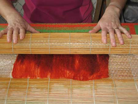
Now the physical part, roll up the bamboo pad tightly with
the fibres inside and begin rolling, you should roll the pad 100 times
constantly checking the progress of the felting - don’t be afraid to put a bit
of elbow grease into it. Continuously douse the felt as you are rolling as it
will help in the matting process. When the felt is fully matted the fibres
should not lift easily from the surface. In the final stages of the felting you
must rinse the felt and get rid of most of the water, I recommend throwing it
at the sink as the force of impact causes the water to travel from the felt.
Allow to dry.
You can also make a felt bowl with this method by placing a
strong disc of plastic in between layers of felt fibre and rolling in the same
manner as you have done above. When the felt is dry cut a circle on one side of
the felted disc and remove the disc, it may need a little manipulation to make
it more of a bowl shape.

I felt that the process has been beneficial for me as I had
never had the opportunity to make felt before, though I had always been told
about it. Yet, there are several constraints with the medium that in my mind
act as a ‘deal breaker’ when it comes to me and felting. The materials, the
wool in particular, is too expensive for just experimental use, as a student it
is a lot of money to put into a medium that I may not use. You are also limited
with the size of felt pieces that you can create; if I was to use felting I
would need to make large panels for it to be any use.
Wednesday, 12 February 2014
Silk Paper Making
Being the first time I had ever come across this medium, I
found it to be an incredibly simple process – simple enough for even me to deal
with. Silk paper is a thin layer of silk fibres that have been compressed
together by a thin layer of cellulose paste. The outcome leaves a sheet of smooth
paper-like material that can be sewn into, cut up, moulded.

Firstly, you will need two square cut sheets of voile, silk
fibres, and cellulose paste. I would also recommended doing this on a washable
surface as the cellulose paste can be quite sticky. Place a sheet of voile onto
the surface making sure it is flat. Taking your silk fibres, begin layering
wispy pieces of fibres down onto the voile, gradually building up an even
layer. At this point you may also want to add threads or ribbon for added texture.
Place the second square of voile over the top of the silk fibres. You can now begin
using the cellulose paste; it may need a good mix with a little water, it
should be like the consistency of custard. Evenly spread the paste over the top
layer of voile, using your hand to push it through the voile. All the fibres
should be covered with the mix to ensure the best results. Gently remove the
voile and lift the silk fibres from the sheet then lay down on a flat surface
to dry. You may also want to try moulding the paper around a cup or bowl,
anything that takes your fancy.


The process is very easy to pick up and is an ideal method
of creating textile art. However, for me there are a variety of constraints
that I have found with the medium. I cannot see myself using it on a regular
basis as it is quite limited in its results and the materials are also very
expensive. I would only invest in the materials if I was going to use it on a
regular basis. But, as I always say don’t allow me to put you off; it is
definitely worth the try.
Subscribe to:
Posts (Atom)